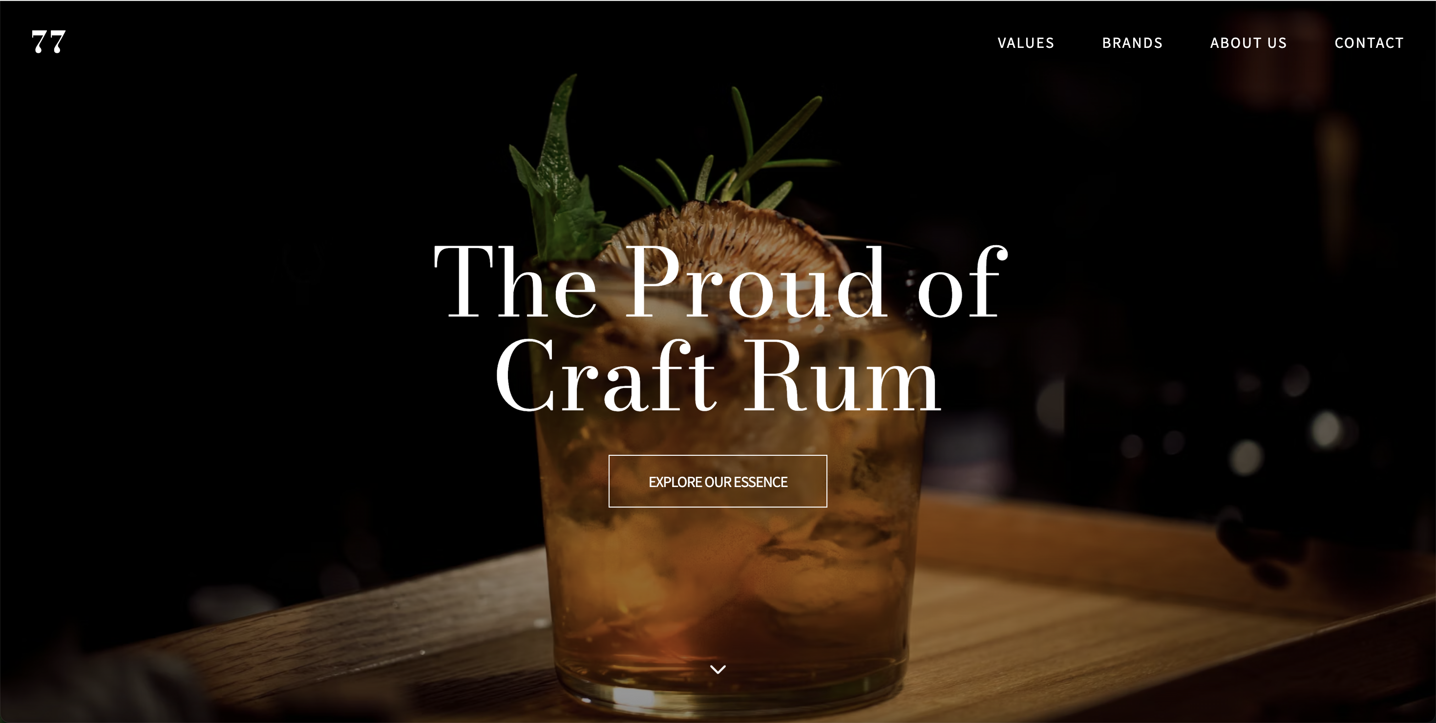
01. Overview
Project Goal
Redesign the 77 Spirits single-page website into a professional B2B conversion tool. The aim was not only to improve visual appeal, but to reduce friction for key stakeholders (wholesalers, importers, and financial partners), build stronger trust, and drive business growth through higher-quality inquiries and faster partnerships.
Background
During a college project, co-founder Natasha asked me to improve their existing website. While the initial request was for better aesthetics, I approached it as a business opportunity to create a credible digital presence that supports real growth.
- ▪ Role: Solo UX/UI Designer (Research, IA, Interaction Design, Figma Prototyping)
- ▪ Constraints: Single-page structure only, using existing brand assets.
Industry Context & Expected Impact
In the premium spirits market, partners evaluate brands in seconds. This Task-First redesign accelerates trust-building and positions 77 Spirits for stronger domestic results and international expansion — especially in Canada, where importers prioritize professional, easy-to-navigate websites.
02. User Personas
Persona A: Michael Chen (42)
Liquor Wholesaler Buyer
"I need clear, trustworthy business credentials instantly. I don't have time to dig through a messy website just to find standard B2B contact channels."
Background
Purchasing manager at a major liquor wholesale company. Manages dozens of new proposals monthly, looking for highly reliable and profitable partners. He is constantly pressed for time and needs to make quick decisions.
Goals
- Quickly verify product quality, reliability, and business terms (e.g., wholesale price ranges).
- Select low-risk (verified and trustworthy) partners to report to upper management.
- Deal only with businesses that respond rapidly to inquiries and offer a seamless contracting process.
Key Pain Points
- Critical business info (wholesale prices, certifications, contact info) is buried or scattered across the current single-page site.
- Too many unorganized certificates and awards make it hard to intuitively grasp "true credibility."
- Confusing navigation requires unnecessary clicks and scrolling to reach key information.
- Scattered contact methods cause hesitation and friction when trying to reach out.
Persona B: Sarah Patel (35)
Bank / Finance Relationship Manager
"I treat a brand's website as a digital handshake. A structured, transparent presentation of founders and credentials instantly builds the foundation of creditworthiness."
Background
Responsible for the food & beverage sector at a commercial bank. Conducts credit due diligence on potential borrowers and investment targets daily. Uses company websites as a "first-impression credibility check tool."
Goals
- Quickly assess a company's professionalism and structural business stability.
- Clearly understand the background and track record of the co-founders.
- Accurately evaluate future partnership, alliance, and credit opportunities.
Key Pain Points
- Co-founders' information is blended into a single photo with minimal text, making it hard to identify who manages which area of the business.
- Credibility signals (testimonials, awards, and qualitative data) are either lacking or buried at the bottom of the page.
- The company's physical office address is not clearly disclosed, creating a barrier to in-person meetings and formal due diligence.
03. Problem Definition & Key Challenges
The Core Project Goal
The goal of this redesign was not just to create a more visually appealing website, but to build a highly effective **B2B conversion tool**. By reducing friction for wholesalers, importers, and financial partners, the new design aims to accelerate decision-making, strengthen credibility, and drive business growth through better inquiries and partnerships.
Key Challenges Identified
Through heuristic evaluation of the existing site and analysis of our primary B2B personas, four major friction points were identified:
Scattered information and visual clutter made it difficult for busy professionals to find critical business details (wholesale terms, certifications, contact info) quickly — often taking 30–60+ seconds.
Technical certificates were hard for non-experts to understand, and the lack of clear Testimonials or founder profiles weakened trust-building.
Redundant menus and multiple scattered contact methods created decision fatigue, discouraging users from completing inquiries.
Unclear presentation of physical location and company background raised barriers to in-person meetings and formal due diligence, leading to higher abandonment rates.
04. Design Strategy
Core Approach: Task-First Design
The primary UX strategy shifted from a traditional “showcase-style” website to a Task-First B2B platform. Rather than centering decisions around visual decoration, every layout and design choice was engineered to help key stakeholders complete their vital business objectives with maximum speed:
Evaluate Credibility
Instantly verify regulatory, clinical, or corporate trust standards.
Locate Business Info
Access clear product details, team background, and distribution terms.
Absorb Value Prop
Understand why 77 Spirits is the ideal partner in the market.
Initiate Contact
Engage smoothly via frictionless, single-click dynamic pathways.
Key Design Principles Applied
Clarity over Complexity
Eliminated secondary visual noise, dense overlapping graphics, and confusing B2C-oriented features to dramatically lower cognitive fatigue for fast-paced professional buyers.
Strong Information Hierarchy
Structured the content stream specifically around professional B2B evaluation sequences: Trust & Verification Signals → Product Range → Core Leadership Team → Optimized Call to Action.
Single-Page Optimization
Working within the single-page technical constraint, the design uses contrasting visual background grids, custom section division elements, smooth scroll anchoring, and generous whitespace to keep exploration natural.
Refined B2B Aesthetic Tone
Adopted a high-contrast, premium dark and warm-cream palette that hints at brand heritage and corporate stability while remaining fresh, clean, and highly readable on modern screens.
Information Architecture
We conducted a thorough audit of all existing content fragments and rebuilt the single-page roadmap. By structuring navigation to follow standard enterprise-level decision paths, the updated structure eliminates extraneous options and drives users directly down a high-trust conversion tunnel:
Main User Navigation Flow
05. Design Solutions & Usability Improvements
We focused on transforming the website from a visually cluttered brochure into a clean, task-oriented B2B platform. Below are the key improvements implemented in the redesign, featuring direct visual comparisons and structural analysis:
01. Replacing Certificates with Testimonials

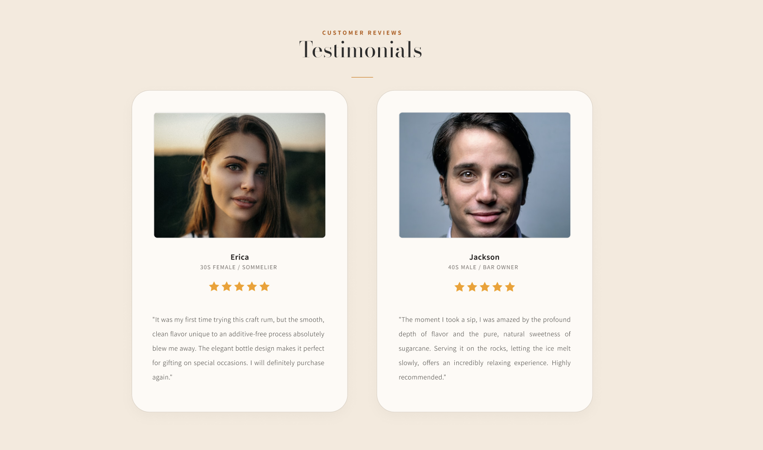
Current Issue
Prominent placement of industry certificates that were too technical and difficult for non-experts or general business buyers to quickly comprehend.
Solution Implemented
Replaced technical sheets with authentic customer Testimonials. Qualitative proof from real partners builds trust far more effectively, helping B2B stakeholders instantly perceive brand credibility.
02. Optimizing the Color Palette
Current Issue
The high contrast of intense black and vibrant mustard-colored blocks triggered severe visual strain, causing unnecessary friction and breaking the luxury tone.
Solution Implemented
Designed an elegant system combining deep neutral blacks and warm, comforting soft cream backgrounds. This preserves high readability while projecting a high-end heritage feeling.
03. Streamlining Global Navigation


Current Issue
The header was filled with repetitive, overlapping anchor links that confused users and created an unfocused brand image.
Solution Implemented
Consolidated adjacent modules and optimized architecture exclusively for a single-page B2B loop. Stakeholders can now navigate directly to vital decision-making nodes within milliseconds.
04. Clearly Distinguishing the Co-Founders
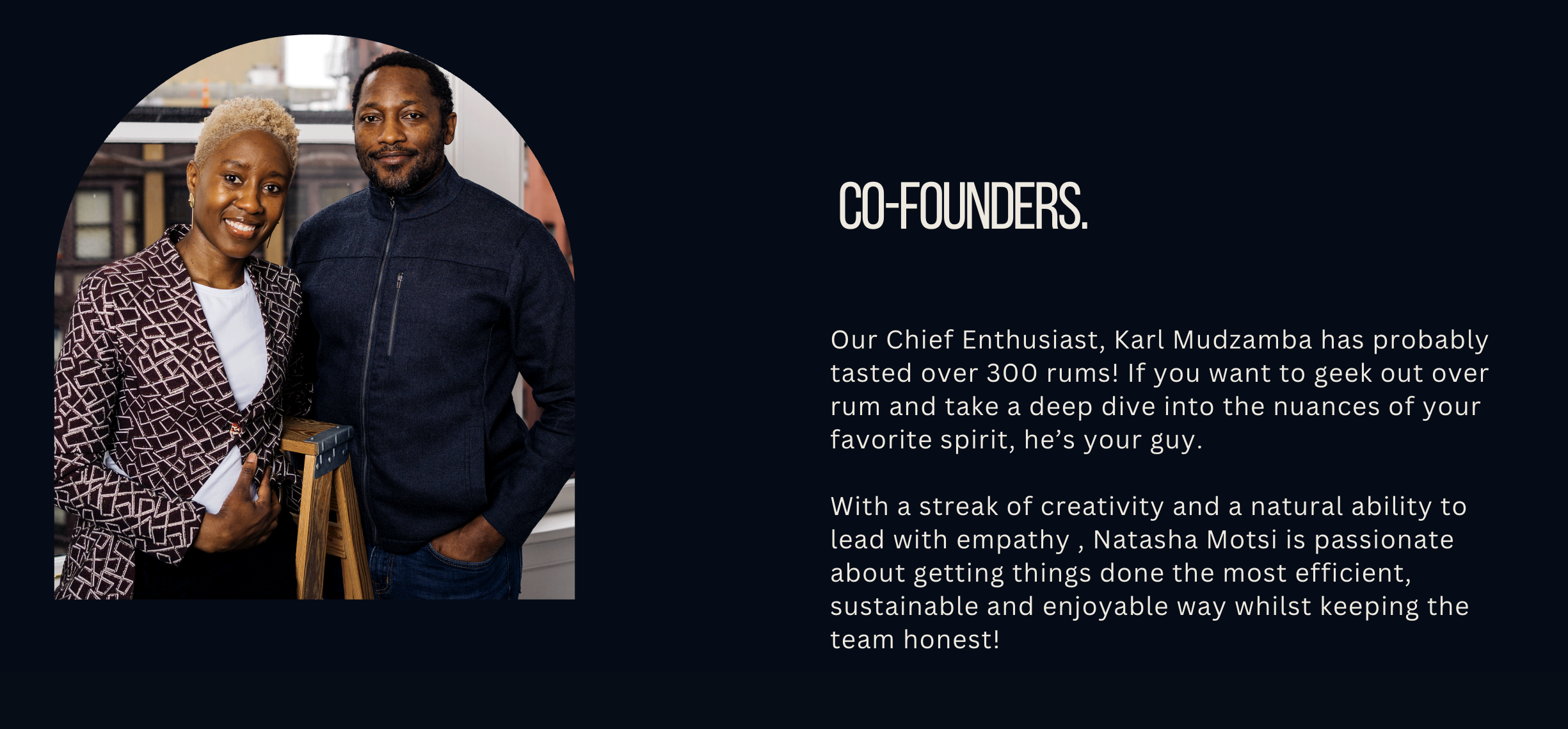
Current Issue
Both co-founders were represented within a single joint picture and small paragraph, obscuring individual executive roles and background details during partner assessments.
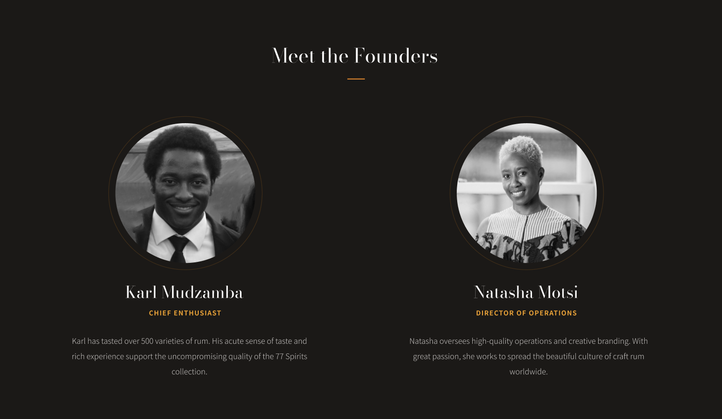
Solution Implemented
Created dedicated executive profile blocks showcasing high-fidelity headshots, precise organizational titles, and specialized professional biographies. This highlights clear responsibility mapping and elevates overall commercial authority.
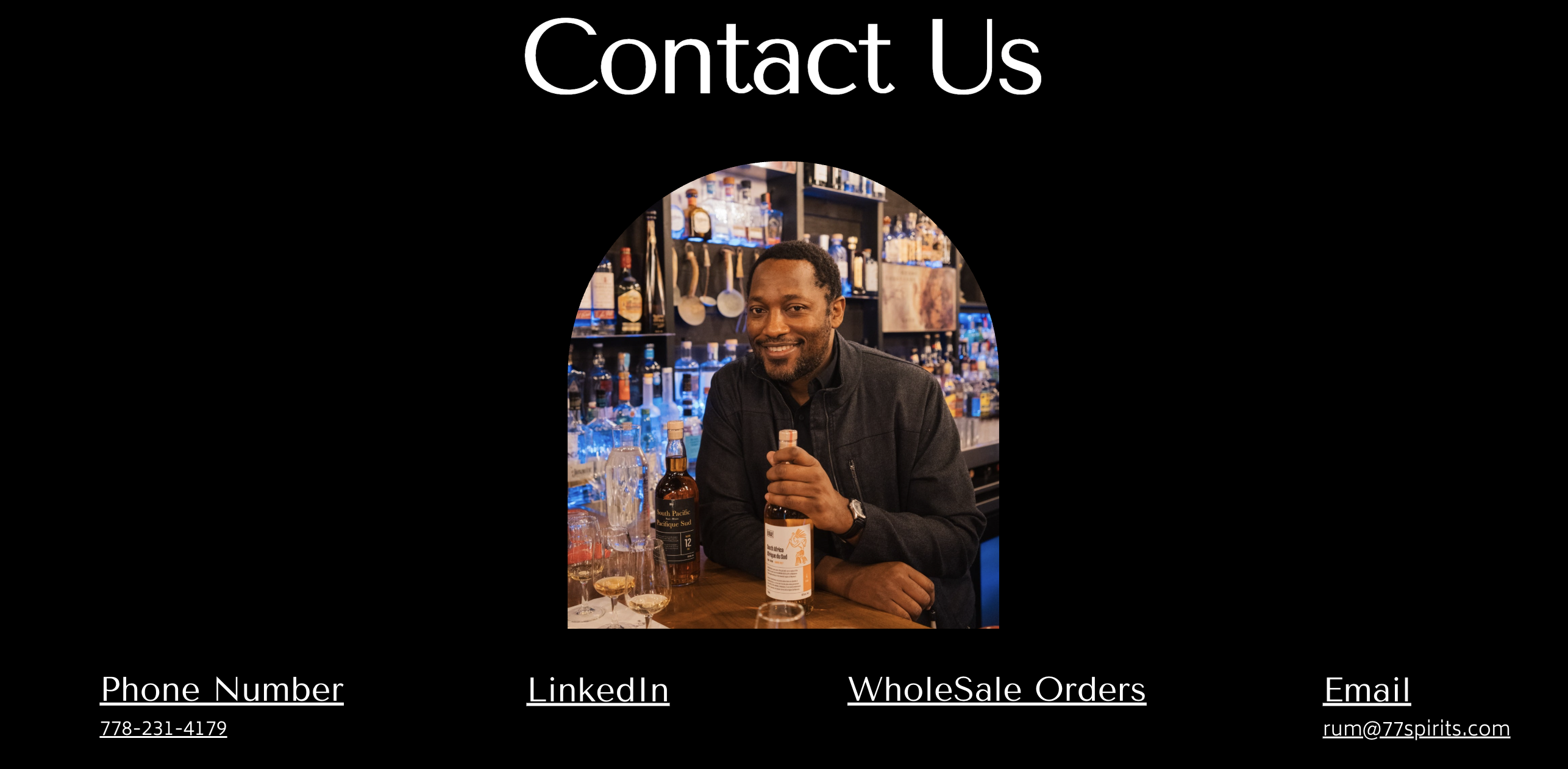
05. Consolidating Contact Methods
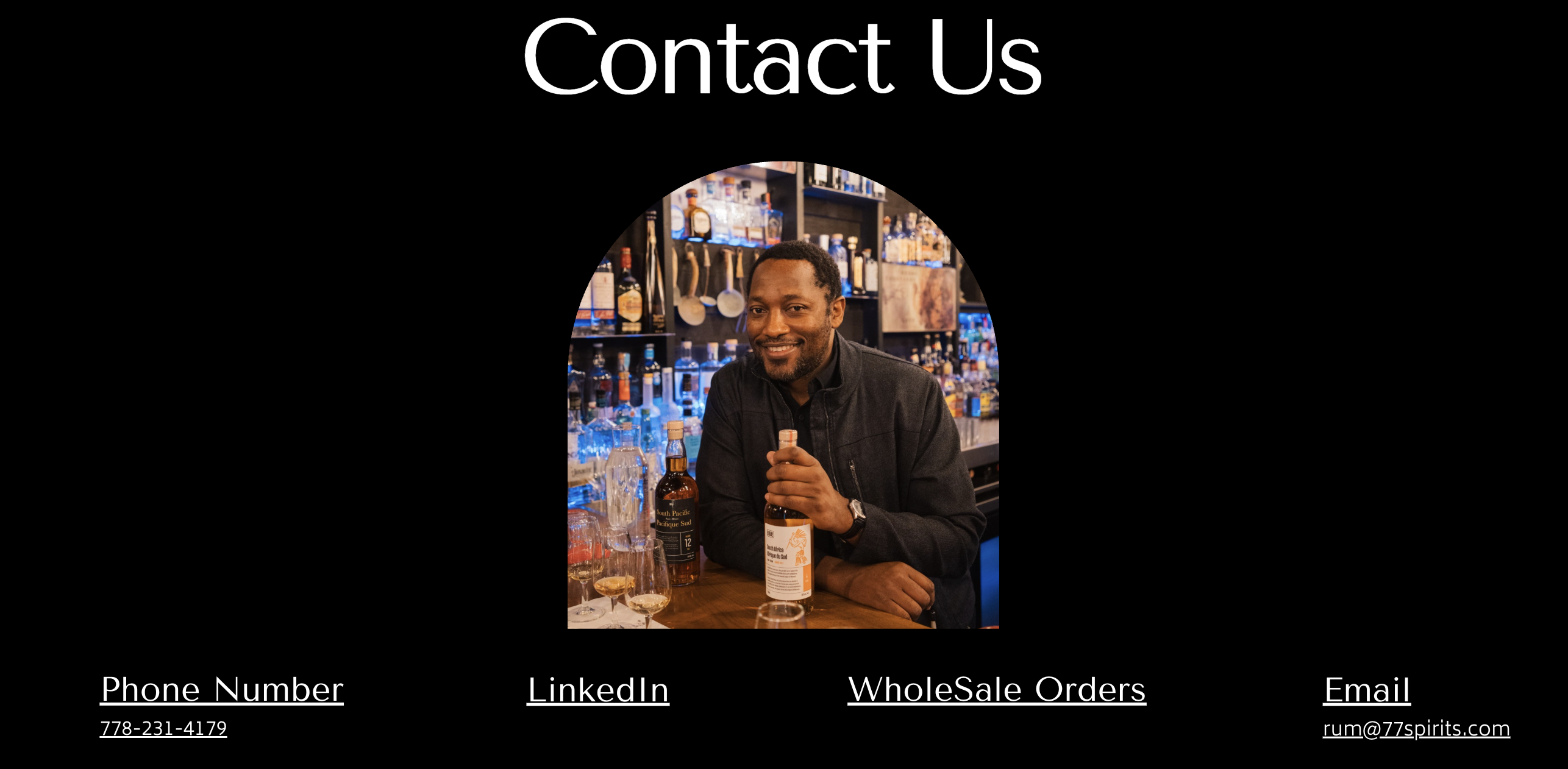
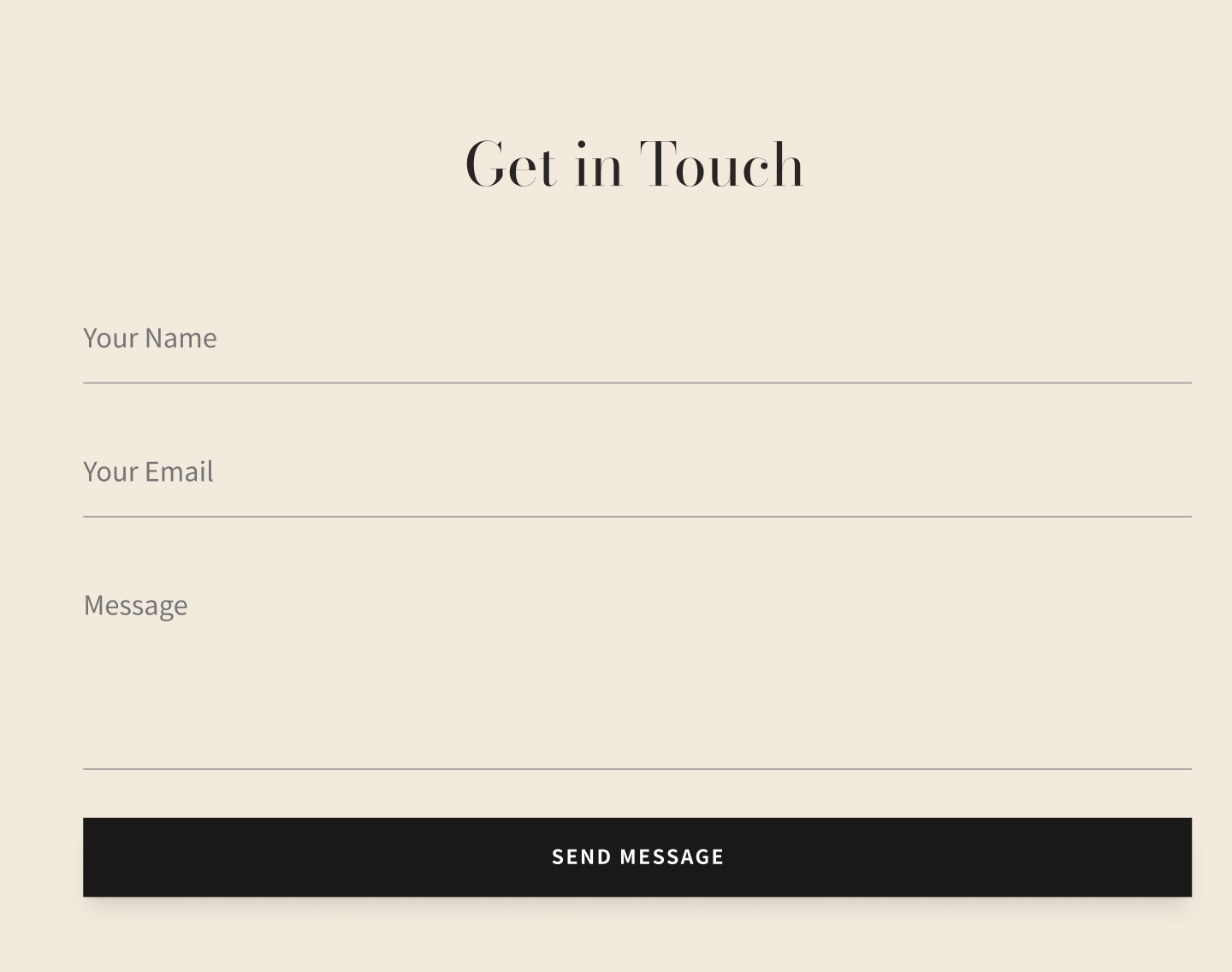
Current Issue
Providing four separate call channels caused severe choice fatigue, leaving professional prospects questioning where official inquiries should be logged.
Solution Implemented
Synthesized all lead funnels into one highly optimized contact hub. Removing alternative routes channels attention directly into structured partner processing.
06. Integrating an Interactive Map in the Footer
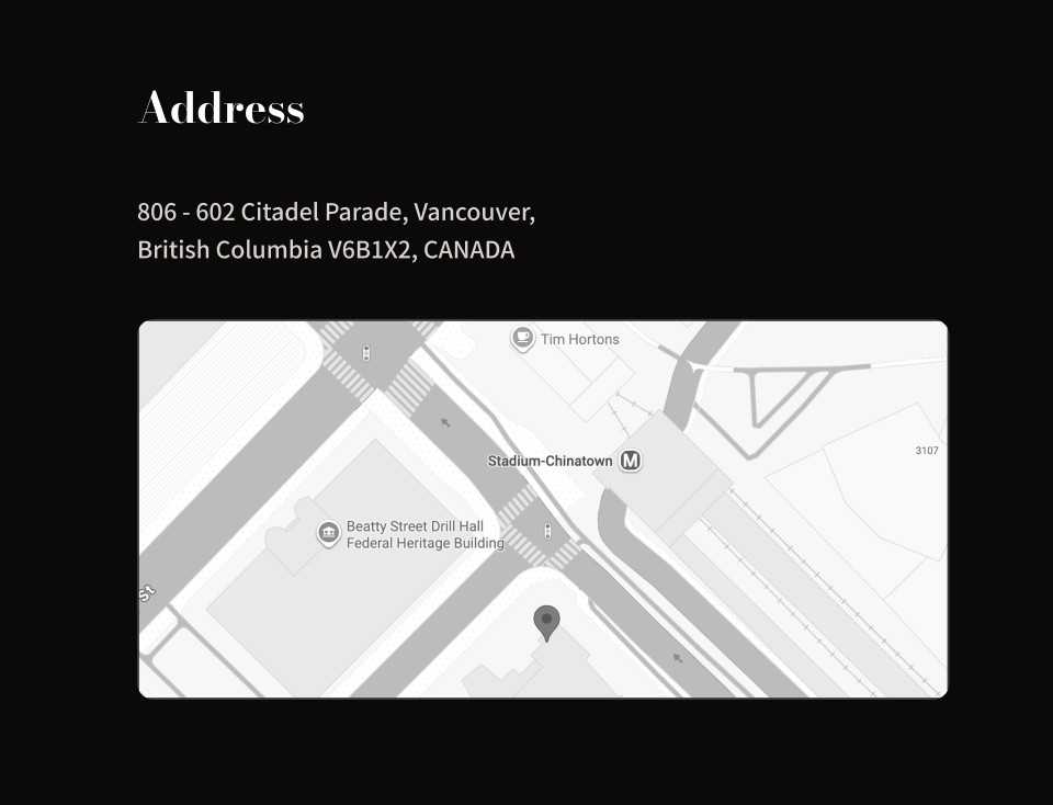
Current Issue
Providing only raw text forced users to manually exit and perform external lookups, presenting a significant barrier for stakeholders planning real meetings.
Solution Implemented
Directly embedded a customized interactive Google Map widget into the footer. This reduces exploration friction and signals active transparency for corporate site visits.
06. Final Design & Deliverables
The final design transforms 77 Spirits' presence from a static, cluttered layout into a task-first B2B engine. By aligning the single-page constraints with verified enterprise user flows, we created a seamless tool for institutional expansion:

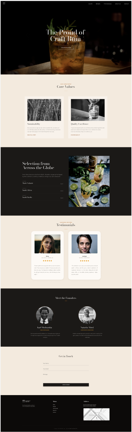
Strategic Redesign Verdict
By stripping away visual clutter, reorganizing critical data blocks, and establishing a high-contrast premium tone, this proposal bridges the gap between digital handshakes and commercial trust. The new single-page B2B tool lowers cognitive load, speeds up evaluation processes for distributors and financiers alike, and paves a friction-free path to conversion, establishing the framework for sustainable brand expansion.
07. Validation & Expected Business Impact
Usability Testing & Quantitative Outcomes
Tested with B2B stakeholders. Consolidating scattered, repetitive modules drastically streamlined direct paths to essential business details.
Qualitative trust scores rose sharply following the introduction of structured co-founder profiles, unified location maps, and curated partner testimonials.
The percentage of prospective partners successfully reaching and initiating the final inquiry form doubled due to the removal of scattered touchpoints.
Expected Business Impact
By shifting away from a static brochure toward a task-first B2B conversion engine, the following business outcomes are projected based on standard spirits industry benchmarks and trade data:
Accelerated Lead Generation
Eliminating unorganized and scattered contact methods is expected to improve the overall inquiry rate by 30% to 50%, driving a 2x to 3x increase in highly qualified wholesale B2B leads.
Sales Cycle Acceleration
The time required for prospective buyers and distributors to establish initial corporate trust is projected to decrease by 40% to 60%, significantly reducing friction in the early negotiation stages.
Wholesale Revenue Optimization
Optimized trust signals and product alignment contribute to a projected 15% to 30% growth in conversion rates within wholesale channels, transforming passive traffic into lucrative strategic partnerships.
Canadian Market Expansion Opportunity
Canada imports over CAD 1 billion worth of alcoholic beverages annually, with premium and craft spirits seeing steady growth.
By establishing a professional, task-oriented digital presence, 77 Spirits can significantly improve its appeal to Canadian importers and distributors.
Securing even 1–2 solid Canadian wholesale partners has the potential to generate hundreds of thousands to over CAD 1 million in additional annual revenue, representing a meaningful growth catalyst for the brand.
Note: These projections are based on standard B2B website redesign benchmarks and Canadian spirits import data.