Project Overview
In this post, I would like to introduce the student portal used at Langara College. By logging in with a student ID and password, users can access a variety of essential features, such as course registration. For students, this portal is an indispensable part of daily life, serving as a hub for course schedules and academic information. While the current system technically fulfills its role by consolidating information into one place, there is significant room for improvement in terms of usability. As you can see in the image below, the current interface leaves much to be desired.
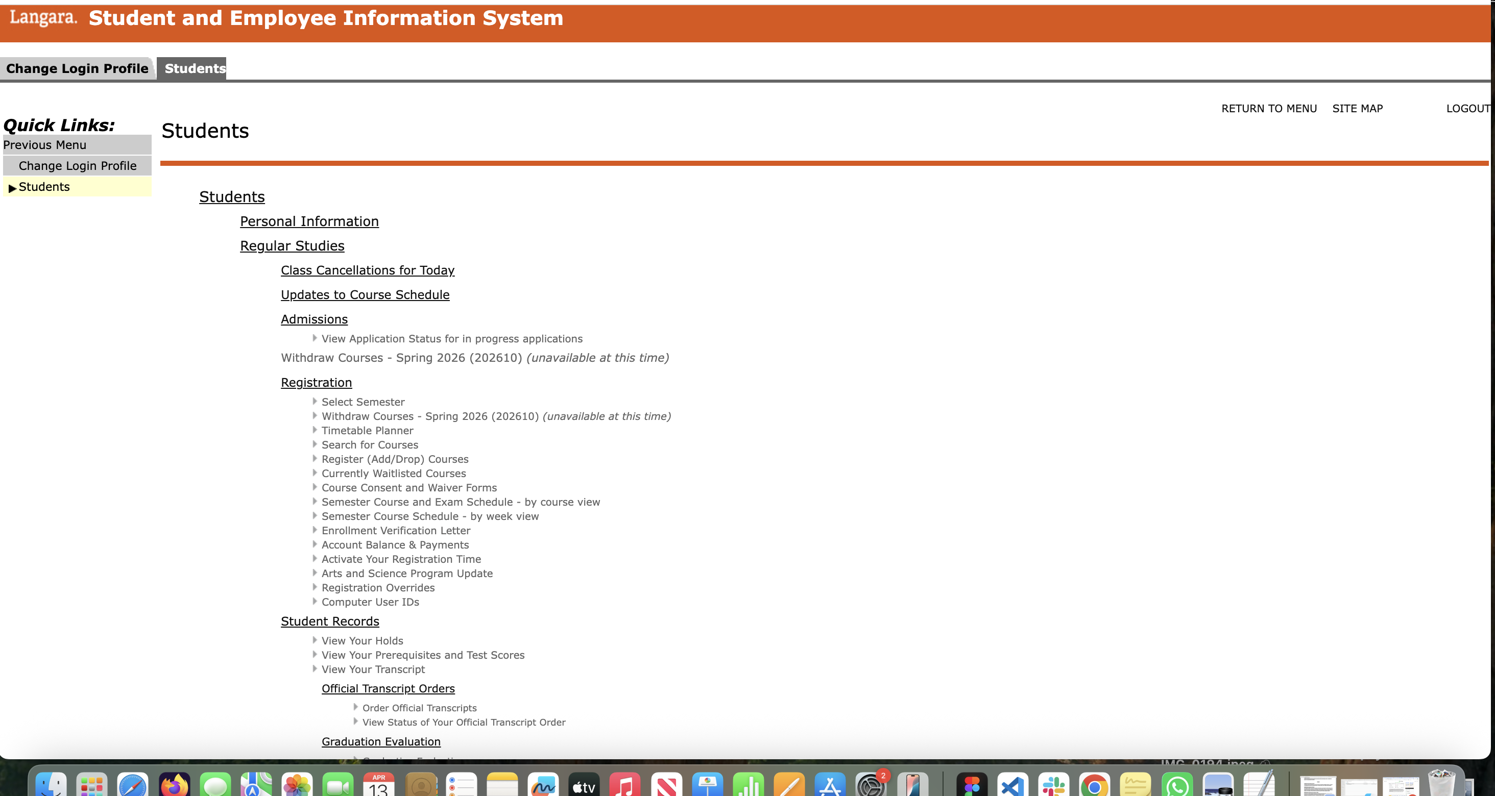
Current UI: The existing dashboard with dense text lists
Identifying the Problem
The current Langara College student dashboard features a left sidebar filled with small text. To me, this layout feels cold, sterile, and frankly, boring. Furthermore, because the font is so small, it is easy to misread or click the wrong link.
Langara also offers "Continuing Studies" courses, which attract students in their 50s and 60s. It isn’t hard to imagine how difficult this interface must be for those dealing with age-related vision changes (presbyopia). The goal of this project was to create a design that is easy for everyone to see and navigate.
The Design Solution
My first priority was to move away from a "mechanical" feel and toward a more sophisticated, stylish UI. However, I didn’t want to focus solely on aesthetics; I wanted to ensure that information was organized so that users could navigate intuitively.
From Text Links to Buttons
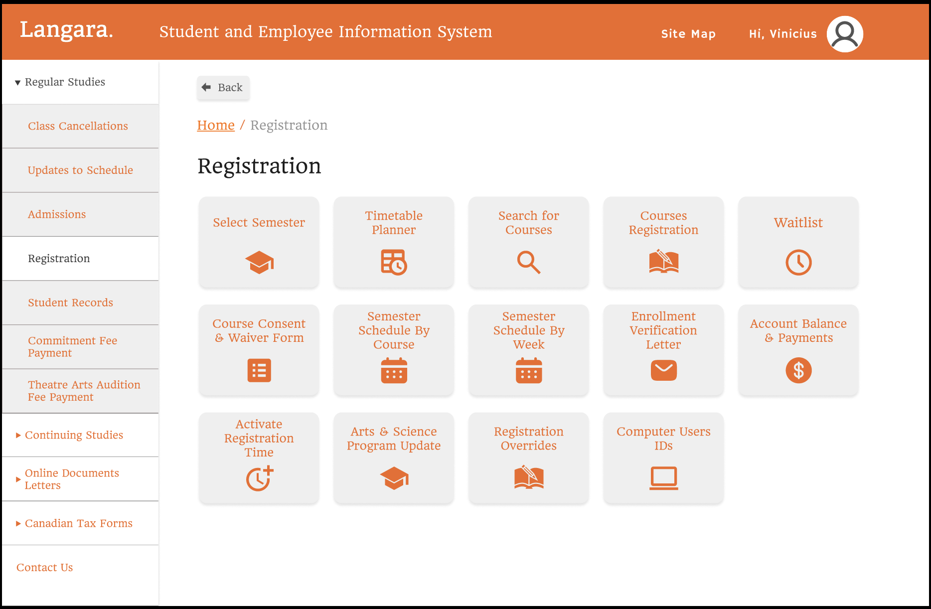
Proposal: Navigation buttons with intuitive icons
I replaced the tiny text links in the sidebar with clearly defined buttons. This makes the navigation more visual and much easier to click, ensuring a seamless experience for all users.
Intuitive Course Registration
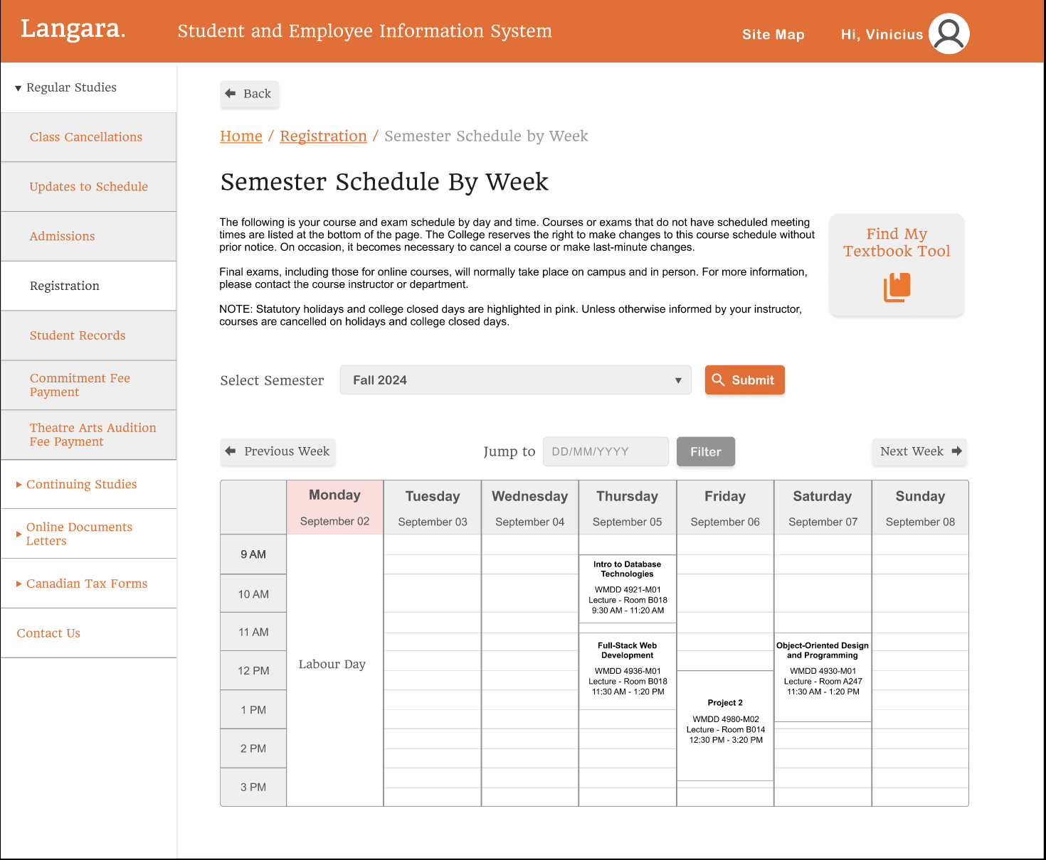
Proposal: Visually organized weekly schedule and clear actions
Course registration involves a vast amount of data—searching for classes, viewing timetables, and processing tuition payments. When faced with too many text-only options, users often hesitate before deciding where to click. By pairing text with recognizable icons, I reduced the "cognitive load," allowing users to instantly identify their next step.
Visualizing Course Data
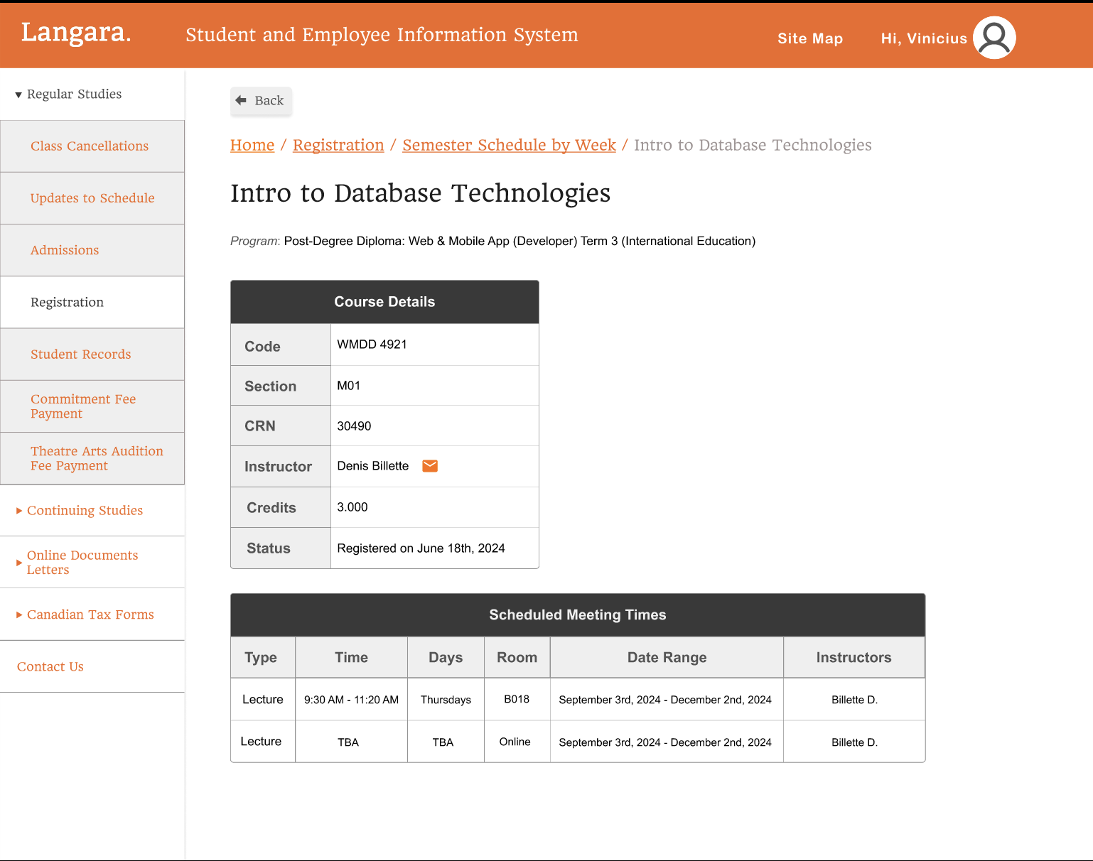
Proposal: Table format for clear data access with quick-action icons
For the course information page, I utilized a table format to display the instructor, schedule, and location at a glance. I also added a mail icon next to each instructor’s name. This allows students to contact their professors directly without the hassle of looking up or memorizing email addresses—a small detail that makes a big difference for the user.
"Even if I am accustomed to using a system, it is a mistake to take it for granted in my portfolio. Just because I have grown used to it doesn't mean it’s right for everyone else."
Reflection: Empathy in Design
Before this project, I used the Langara dashboard every day without much thought. While I found it a bit bland and the text small, I had simply grown accustomed to it. However, this assignment taught me that just because I am used to a system doesn't mean it’s "correct" or "good."
I spoke with a student in their 40s who mentioned that, due to declining eyesight, they found the text-heavy UI incredibly difficult to use, even after a long period of time. This conversation reinforced the idea that UX/UI design must be accessible regardless of age, gender, or nationality.
When designing a website or app, it is vital to look beyond your own perspective and consider the client, the customer, and—most importantly—the end user. To grow as a designer, I’ve realized I must remain curious about how different people perceive the world. By considering the "eyes of others," I can create designs that are truly inclusive and effective.